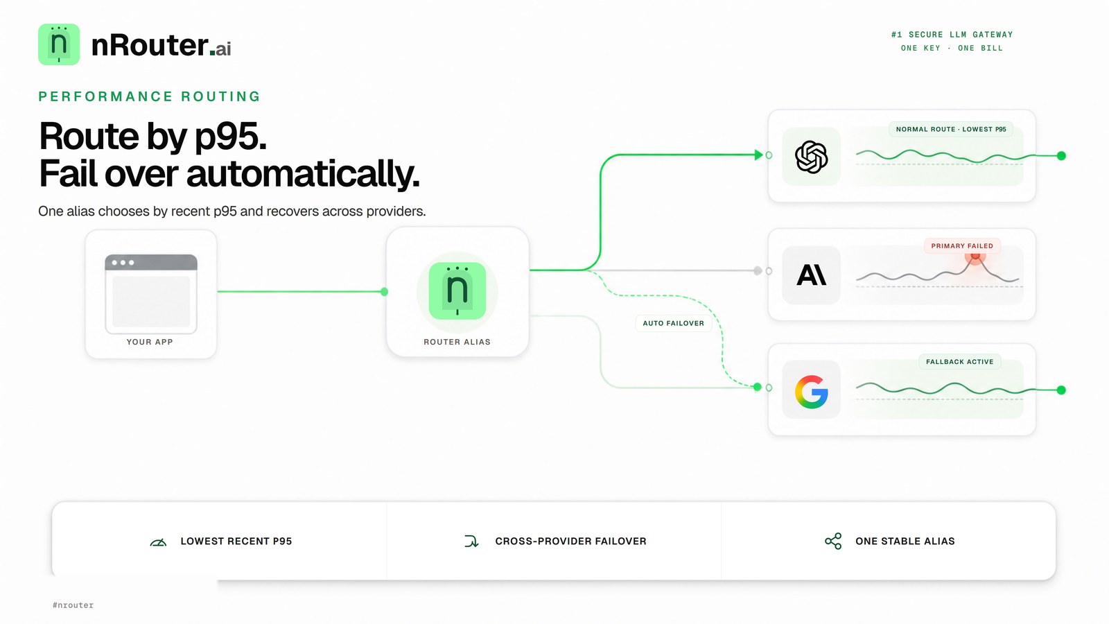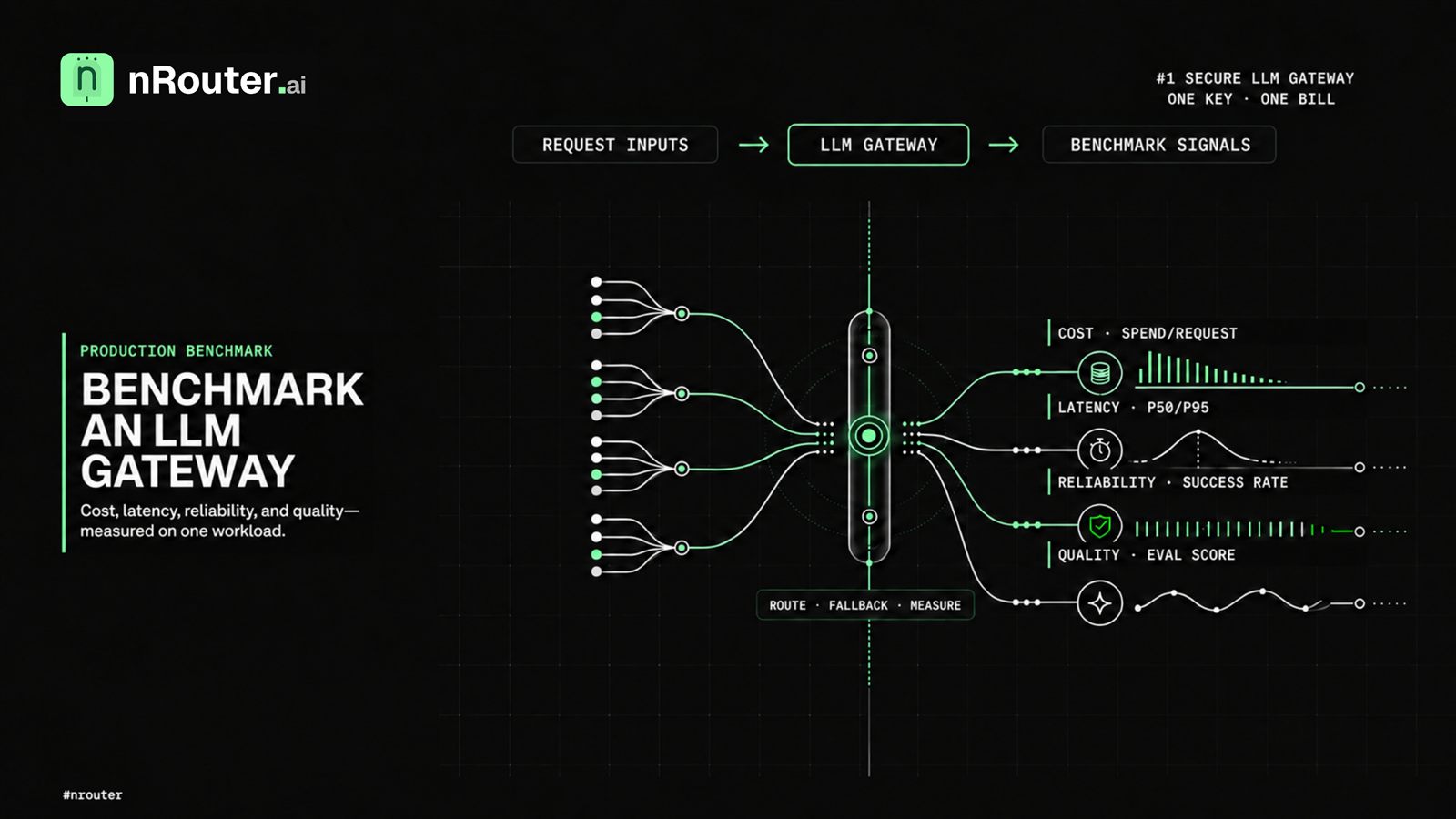
The Direct Answer: Analyzing raw LLM request volume conceals critical financial reality: 5% of complex agentic or reasoning queries typically drive over 60% of total model spend. nRouter's dual-axis cost-vs-usage analytics overlay request volume against dollar spend per model, per customer, and per prompt template. This isolates expensive outlier tasks from high-volume, low-cost operations, allowing teams to deploy intent tiering and smart routing where savings compound immediately.
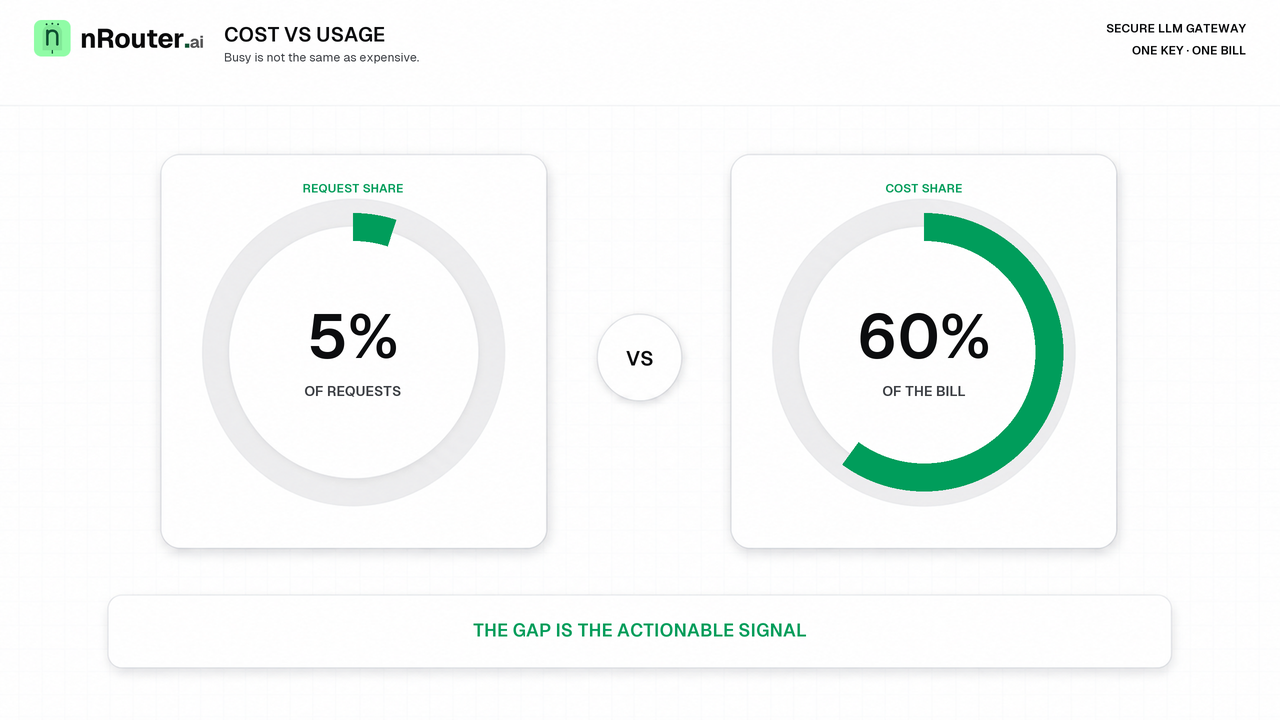
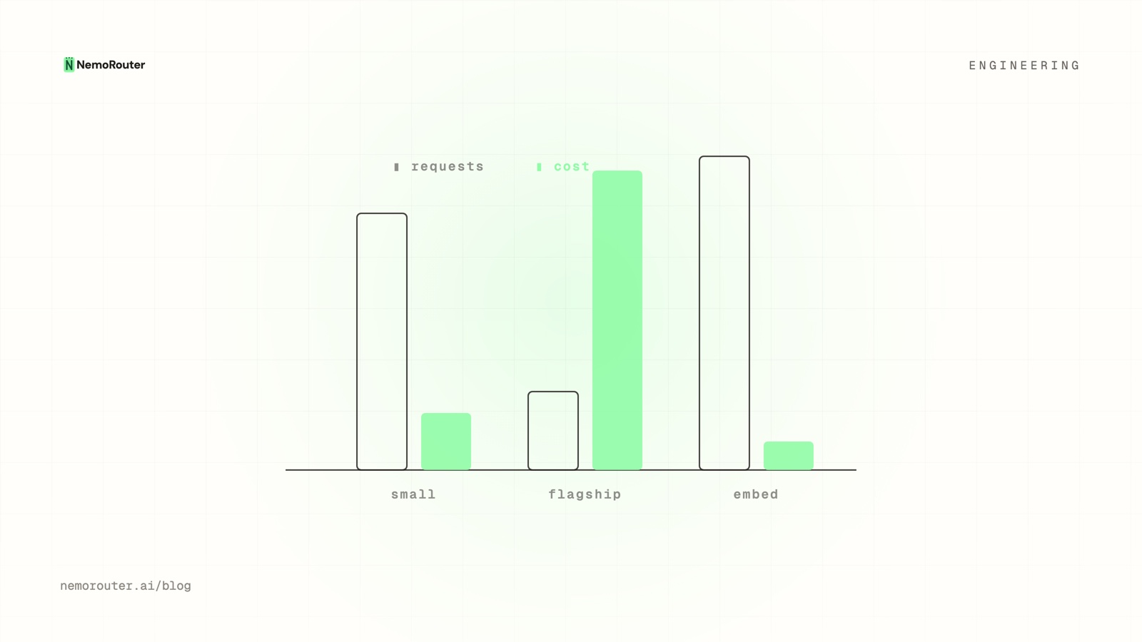
Figure 1: Cost vs Usage Disagreement — Overlaying request volume against total dollar expenditure to expose high-cost, low-volume optimization surfaces.
The short answer: count requests and you learn what is busy; count dollars and you learn what is expensive. Only overlaying the two shows you where they disagree — and the disagreement, not either number alone, is the thing you can act on.
A model that serves 5% of your requests can be 60% of your bill. On a volume chart it is a stub you never look at. On the invoice it is the line item that made someone schedule a meeting. Cost-vs-usage analytics exist to make those two facts appear next to each other, because separately they are both true and neither is useful.
The problem in one request
Start with a single call, because the aggregate is just this repeated.
request A   small model,   600 in / 120 out   →  reported cost  $0.0004
request B   flagship,    24,000 in / 1,800 out →  reported cost  $0.1650
Two rows in your request log. Two increments of 1 in a request counter. And a
412× difference in what they cost.
Now scale it: request A happens 190,000 times this month and request B happens 10,000 times. By volume, A is 95% of your traffic. By dollars, B is 81% of your bill. Every dashboard tile that counts calls will make A look like the thing to optimize. Every dashboard tile that counts dollars will point at B. Only the two side by side tell you the truth, which is that A is fine and B is your entire optimization surface.
Why the naive approach breaks
The instinct is to watch request volume, because that is what every API dashboard has shown you for a decade. For an LLM gateway it is close to useless on its own, for three reasons.
- Per-request cost varies by orders of magnitude. In a conventional API a request is roughly a request. Here the spread between the cheapest and most expensive call in the same account is routinely three orders of magnitude — compare the per-million-token rows on OpenAI's pricing page, Anthropic's and AWS Bedrock's and the smallest and largest models in a single family are already far apart. So a count is a measure of activity, not of money.
- Volume optimization targets the wrong thing. Cutting 20% of your cheapest traffic feels like progress and moves the bill by fractions of a percent.
- Volume hides the failure mode that costs the most. Prompt bloat — the same number of calls, each carrying more context — is completely invisible to a request counter, and it is the most common way an LLM bill grows without anyone shipping a feature.
The second naive move is the mirror image: watch only dollars. That tells you what is expensive but never why, so you cannot distinguish "we grew" from "we got wasteful" — and those need opposite responses.
Why cost and usage diverge
The overlay is worth building because the divergence is structural, not incidental. Four causes, all ordinary:
| Cause | Effect on the chart | Ordinary trigger |
|---|---|---|
| Model price spread | A thin usage slice with a fat cost slice | One task routed to a flagship, everything else to a small model |
| Prompt shape | Cost per call rises with usage flat | More conversation history, larger retrieval chunks |
| Direction asymmetry | Output-heavy tasks cost more per call | Summarize-long vs generate-long |
| Modality | A handful of calls, an outsized share of cost | Image, audio or video generation mixed into a text workload |
Here is what that looks like as a share table for one month of traffic:
              requests        cost
small model     78%           14%      ← high volume, low cost
flagship        12%           71%      ← low volume, dominates the bill
embeddings      10%            5%
The flagship line towers over its modest request share. That gap is the actionable signal: a small slice of traffic you may be able to route, cache or down-size, for a large slice of the bill.
The four shapes worth recognizing
Overlay cost and usage over time and the same four patterns keep appearing. They imply different actions, which is the whole reason to name them.
| Pattern | Cost vs usage | What it means | The move |
|---|---|---|---|
| The whale | Cost ≫ usage | A pricey model on a minority of calls | Ask whether a cheaper model clears the bar for that task |
| The bargain | Usage ≫ cost | A cheap model doing real work | Safe to send it more |
| The leak | Cost rising, usage flat | Per-call cost crept up | Investigate: prompt bloat, lost cache, price change, silent model swap |
| The spike | Both jump together | Genuine traffic increase | A capacity and budget question, not an efficiency one |
The first two are routing opportunities. The third is an investigation. The fourth is a planning input. Same chart, four different decisions — and the common failure is treating a spike as a leak, panicking about efficiency when the business simply grew.
The mechanism: what makes the overlay trustworthy
An analytics view is only as good as the number underneath it, and this is where a gateway earns the chart. Four properties do the work:
- One settled cost per request, produced once. Cost is computed at the gateway from the usage the provider reported, and the ledger, the response header and the chart all read that same value. Nothing recomputes it, so nothing can disagree with it. The full contract is in One Authoritative Cost Per LLM Request.
- Unknown is unknown, not zero. When a call cannot be priced, it is marked
unpriced and the cost header is absent — it is never reported as
$0. A confident zero is how an unmeasured call vanishes from a cost chart and makes the total look better than it is. - Every request carries its identity. Organization, team, key and model are attached at authentication, so a breakdown is a grouping rather than a reconstruction. That is what lets the chart answer "which team" and "which key", not just "which model".
- Aggregation is over settled values only. A hold that was later released never appears as spend, so an in-flight or failed request does not inflate a period and then quietly deflate it.
Take any of those away and the overlay becomes a chart you argue with rather than a chart you act on.
Worked example: a month of traffic, two decisions
One organization, one month, three routes. All figures are that organization's own settled numbers.
| Route | Requests | Share of requests | Cost | Share of cost | Cost per request |
|---|---|---|---|---|---|
search-rerank | 190,000 | 86.4% | $76.00 | 9.2% | $0.0004 |
doc-summarize | 10,000 | 4.5% | $665.00 | 80.5% | $0.0665 |
embed-index | 20,000 | 9.1% | $85.00 | 10.3% | $0.0043 |
| Total | 220,000 | 100% | $826.00 | 100% | $0.0038 |
doc-summarize is the whale: 4.5% of calls, 80.5% of cost, and a per-request
figure 166× the cheapest route. Two decisions follow, and they are different in
kind.
Decision one — test a cheaper model on the whale. Not swap: test. Split
doc-summarize between the flagship and a smaller model with
deterministic A/B testing,
run it for a fortnight, and compare cost and quality between cohorts that each
saw exactly one variant. If the smaller model holds up on, say, half the traffic
at a third of the per-call cost, the arithmetic is:
current      10,000 × $0.0665                  = $665.00
after split   5,000 × $0.0665 + 5,000 × $0.0222 = $443.50
saving                                          ≈ $221.50 / month  (27% of the whole bill)
Decision two — leave search-rerank alone. It is the bargain. Even
eliminating it entirely saves $76, and it is doing 86% of the work. Cutting the
busiest thing on the chart would have been the obvious move from a volume
dashboard, and it would have been almost pure loss.
Note the shape of both decisions: the chart did not tell you what to do. It told you where to look, and the ranking of where-to-look is the value.
Cost rising, usage flat is the one to chase
Of the four shapes, the leak deserves your attention first, because it is pure waste — you are paying more for identical work. Common causes, roughly in order of likelihood:
- Prompt bloat. Context grew — more conversation history, larger retrieval chunks, a new system preamble — so input tokens and cost crept up without more requests. Check cost-per-request against input tokens per request; if they move together and volume does not, this is it.
- Lost caching. A prompt prefix that used to hit a provider's cache now misses, usually because a templating change put something variable near the front. Both OpenAI and Anthropic key their caches on an exact prefix match, so a single variable token near the start of the prompt is enough to lose every hit behind it. You re-pay for repeated input. Server-side prompt templates make prefixes stable enough to notice when they stop being stable.
- A price change. A provider raised a rate. Because the gateway settles on the real number rather than a table you maintain, this shows up immediately and correctly instead of hiding behind a stale rate card.
- A silent model swap. A default moved to a pricier model — a library upgrade, a config change, an alias that now resolves elsewhere.
Attribution turns a worry into a work item
Overlay cost-vs-usage with attribution tags
and the whale gets a name: it is the summarize feature for enterprise
customers, not merely "the flagship model". A breakdown you can assign to
someone beats an aggregate you can only be concerned about.
Edge cases we had to decide
-
When a call cannot be priced, we show it as unpriced rather than folding it in at zero, because a zero would make the chart look better while making it wrong. An unpriced call is visible as a gap you can investigate, which is the only honest option when the input is genuinely unknown.
-
When a request is still in flight, its hold is not counted as spend, because a reservation is a ceiling and not a cost. Counting holds would inflate the current period and then deflate it at settle, producing a chart that revises itself and can never be trusted for a decision.
-
When a request failed and its hold was released, it appears in usage but not in cost, because it happened and it cost nothing. This is the one place the two lines should diverge without meaning anything — a spike in failures looks like a bargain if you forget it. Read failure rate alongside, and see Handling 429 and 402.
-
When a period contains a price change mid-month, we do not retroactively restate earlier requests, because each request settled at the price that was real when it ran. The chart shows a step, not a smooth curve. A restated history would reconcile to nothing.
-
When a model is renamed or an alias re-points, we keep the model identity each request actually ran against, because merging them would erase exactly the swap you are trying to detect. Two adjacent lines are more useful than one clean one that hides the event.
What you see from the outside
- The analytics views — per-model, per-key and per-team cost and usage over daily, weekly and monthly windows, with CSV export. Field by field in Analytics.
- Per-request headers —
x-nr-request-costfor the settled cost,x-nr-cost-statusfor exact-or-unpriced,x-nr-request-idto correlate a chart outlier back to a specific call in your own logs. The cost header is absent when the call could not be priced. - Your own tags — arbitrary attribution dimensions so the breakdown matches how your business is organized rather than how models are named.
- The ledger — the same settled values as individual movements, which is how you check a chart rather than trust it. See How to Read Your LLM Credit Ledger.
All of it is on every plan. Analytics, guardrails, A/B tests, prompt management, evals and per-team budgets are not gated behind a tier — plans vary the platform fee and the rate limits, not the feature set.
Limits
- The chart finds the gap; it does not tell you whether the cheaper model is good enough. That is an evaluation question, and it needs a real test rather than a hunch.
- Short windows lie. A week containing one batch job produces a whale that does not exist. Compare at least two comparable periods before acting.
- Attribution is only as good as your tags. Untagged traffic aggregates into "everything else", and "everything else" is where investigations go to die. This is the same allocation problem cloud finance teams already have a vocabulary for — see the FinOps Foundation's allocation capability.
- It is a rear-view instrument. It tells you what happened, not what is about to. Hard stops come from budgets and rate limits, which act at request time; analytics never prevents anything.
- Provider console figures may differ at the margin. Rounding, currency and billing-period boundaries are theirs. The settled number is what moved your balance and what the chart aggregates.
Try it
Open your analytics view and do exactly one thing: sort by cost, then look at the request share next to the top row. If the top cost row is not also near the top by volume, you have found a whale, and you have found it in under a minute.
Then run the second query that matters — cost per request, this month against last. Flat is healthy. Rising while volume is flat is a leak, and the four causes above are your checklist in order.
If you want to act on what you find, split the expensive route with A/B testing rather than swapping it outright, and put a ceiling under the experiment with budget controls. No account yet? Sign up — a card is required and a $5 minimum charge is taken, with the platform fee on top.
See also
- One Authoritative Cost Per LLM Request, Across Providers — where the number in every one of these charts comes from, and why it is unpriced rather than zero.
- Deterministic A/B Testing Across Model Variants — how to test the cheaper model on the whale without contaminating the result.
- Cost-vs-Quality LLM Routing: Which Tasks Can Go Cheap — turning a confirmed finding into a standing routing rule.
- Attribute LLM Spend by Team, Customer, and Feature — giving the whale a name you can assign to an owner.
- How to Set Hard Spend Limits on Your LLM Gateway — the control that stops a leak while you investigate it.
- How to Read Your LLM Credit Ledger — checking a chart against the underlying movements.
- Models — what is currently routable, so a cheaper candidate is a real option and not a guess.
Sources
Verified 2026-06-15. This post makes no third-party pricing claim; the percentages and dollar figures are worked examples from one organization's own settled data, shown to illustrate the arithmetic rather than to quote a rate card. Current fees and minimums are on pricing. Corrections to hello@nrouter.ai and we will update.
- nRouter analytics documentation: nrouter.ai/docs/guides/analytics
- nRouter observability documentation: nrouter.ai/docs/guides/observability
- nRouter pricing: nrouter.ai/pricing
- nRouter model catalog: nrouter.ai/models
External references, all checked 2026-08-23. Provider rates move; these are linked as the live rate cards the arithmetic above sits on, not quoted here:
- OpenAI API pricing: platform.openai.com/docs/pricing — the per-million-token spread between a small model and a flagship.
- Anthropic pricing: anthropic.com/pricing — the same spread across the Claude family.
- AWS Bedrock pricing: aws.amazon.com/bedrock/pricing — Bedrock is routable on nRouter and AWS publishes its own per-model rates.
- OpenAI prompt caching: platform.openai.com/docs/guides/prompt-caching — why a variable prefix costs you the cache.
- Anthropic prompt caching: docs.anthropic.com — the same mechanism, and its own cache-write and cache-read rates.
- FinOps Foundation, allocation capability: finops.org — the general form of the tagging problem in the last limit above.
OpenAI, Anthropic and AWS are trademarks of their respective owners. nRouter is not affiliated with or endorsed by them.